This is a cache of https://digg.com/data-viz/link/immigrant-numbers-home-country-perception-actual. It is a snapshot of the page at 2024-11-09T01:23:22.455+0000.
This Chart Shows What People Are Getting Wrong About The Immigration Issue | Digg

not adding up

This Chart Shows What People Are Getting Wrong About The Immigration Issue

This Chart Shows What People Are Getting Wrong About The Immigration Issue
The data highlights just how much perception can differ from reality.
· 24.8k reads ·
· ·

The US presidential election is just days away, and immigration is a key issue for many voters โ€” but data shows that almost everyone overestimates how many immigrants actually live in their country.

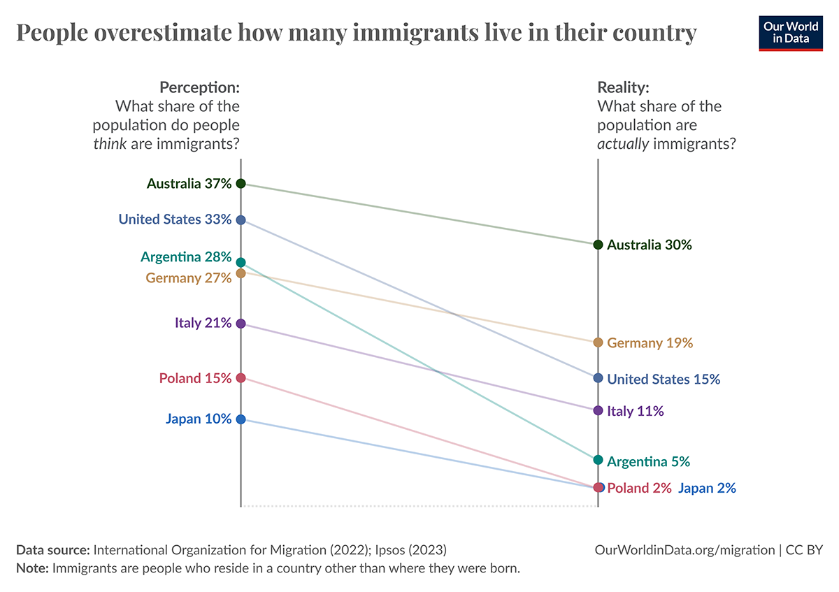
The chart below, made by Our World In Data and based on Ipsos's Perils of Perception Report, shows the difference between people's perceptions of their country's foreign-born population and the actual numbers.

In the US, respondents believe 33 percent of the population are immigrants, when the actual share is less than half of that (15 percent).

People in Poland and Japan think immigrants make up 15 and 10 percent of the population, respectively โ€” but in both countries, the true percentage is only around two percent.

Of the countries analyzed, Argentina was the furthest off overall; there was a whopping 23 percentage point difference between the share of the population respondents believed to be foreign-born and the reality.

Click image to enlarge

immigrant numbers, perception vs actual

Via Visual Capitalist/Our World In Data.

Comments

  1. allen morgan 4 days ago

    Yet another way to obfiscate the issue with statistics...let alone miss what the issue really is.

  2. Martin Garside 5 days ago

    That graph is completely misleading, Australia has 99% immigrants, there were very few Aboriginals before the white people arrived. Same with USA where 90% are immigrants! The only country even close to correct would be Japan, they dont take immigrants into their country!

  3. Thomas Miller 1 week ago

    Doesn't really tell the whole story. It's not just how many people were born abroad. For example certain countries organize flights for pregnant women so they can have their kids in the US, granting citizenship.

  4. Charlie Bess 1 week ago

    Are you only including 'nationalized' citizens, green card (in the USA) holders as well as illegal migrants? That is what you appear to be using, but I am just unsure of your definition and how to interpret the data. Having been to Australia and talked with them about their immigration policies, I found it shocking that the percentage of AU population is twice as high as the USA.

    1. Beware of your biases. You can think of AU as the UK's Florida. Young Brits go there for work, and parents follow to retire. They all blend in. You finding that "shocking" could mean you're not as color-blind as you think.

    2. Jimbo Jenkins 1 week ago

      I dug down to the original source for the chart. They define "immigrant" as "an immigrant being defined as a person born in a country other than the one in which they currently live."


Cut Through The Chaos With Digg Edition

Sign up for Digg's daily morning newsletter to get the most interesting stories. Sent every morning.