About cookies on this site Our websites require some cookies to function properly (required). In addition, other cookies may be used with your consent to analyze site usage, improve the user experience and for advertising. For more information, please review your options. By visiting our website, you agree to our processing of information as described in IBM’sprivacy statement. To provide a smooth navigation, your cookie preferences will be shared across the IBM web domains listed here.
Tutorial
Visualizing data on IBM watsonx.ai
create and customize data visualizations in Data Refinery on the IBM watsonx.ai platform
On this page
Data visualization is the representation of data and information through visual means such as graphs, charts, and infographics. Data visualization is an important part of the data science process. During exploratory data analysis, data scientists generate data visualizations to gain insights, identify trends, and detect anomalies in the data. Data visualizations are also a helpful tool for sharing insights with team members and stakeholders.
In this tutorial, learn how to create and customize data visualizations with the Data Refinery tool on the IBM watsonx.ai platform. You'll use the Supermarket Sales data set to generate visualizations on sales at various branches of a theoretical supermarket chain.
More on data visualization
There are several ways to visualize data. The chart type needed depends on several factors, including the number of variables to visualize, the data type of each variable, and the overall business question that you are trying to answer with the visualization. For example, when looking at sales over a period of time, a line chart might be appropriate, whereas a box plot might be more appropriate when examining the distribution of a single quantitative variable.
Design is a key component when creating data visualizations. It’s important to design effective charts so that users can quickly and easily interpret the visualization. A few best practices when designing data visualizations include:
Select an appropriate chart type: chart types have various purposes, so it’s important to consider the data points that need to be visualized and the overall goal of the visualization.
Add chart titles and labels: Titles and labels provide additional context to the visualization and can provide clarification when another individual is not present to explain.
Use color consistently and intuitively: color is a great way to highlight different areas on a chart and can help identify similarities and differences within a visualization.
Align chart elements and utilize whitespace: Poorly aligned or little to no white space can make a visualization hard to read and interpret.
Most importantly, keep it simple!: Don’t overcomplicate the visual by adding unnecessary clutter. Simplicity is key when designing effective data visualizations.
Designing effective visualizations can often be time consuming depending on the tool used. In this tutorial, you’ll see how you can quickly add detail and design visualizations on the IBM watsonx.ai platform by using the Data Refinery tool.
Prerequisites
This tutorial contains general instructions and excerpts of code. To follow along, download the data set on Kaggle.
To follow this tutorial, you need an IBM cloud Account. If you do not have an IBM cloud account, you can sign up for one to try watsonx.ai for free. If you are creating a free account, Watson Studio, Watson Machine Learning, and IBM cloud Object Storage instances on the Lite plan are all provisioned for you.
Estimated time
It should take you approximately 20 minutes to complete the tutorial.
Steps
In this tutorial, you use the Data Refinery tool on IBM watsonx.ai to visualize sales for a supermarket chain across various branches, to identify trends and patterns in their sales data.
The overall steps that you will follow are:
- create a watsonx.ai project, and upload a data set.
- create a new Data Refinery asset.
- create and format a data visualization.
- Export a data visualization.
Step 1. create a watsonx.ai project and load data set into the project
The project stores all of the materials related to this analysis on the IBM watsonx.ai platform.
Log in to watsonx.ai by using your IBM cloud account.
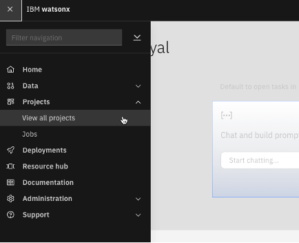
Select Projects, then View all projects from the left pane.
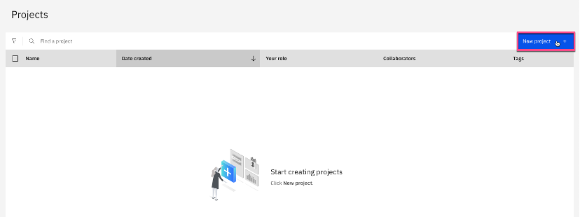
create a watsonx.ai project by clicking New project on the upper right of the Projects page.
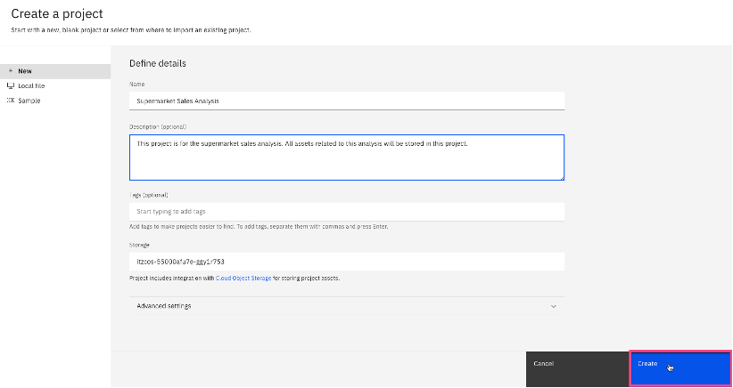
Define the project details, including Name and Description, and click create.
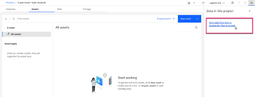
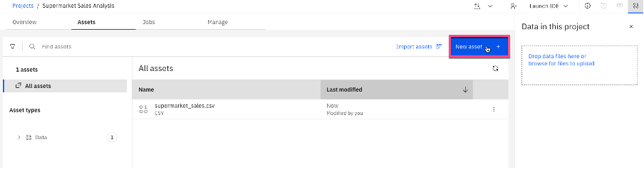
Select Assets, then Drop data files here or browse for files to upload. Select the data file from your machine to upload the data set for this analysis. When loaded, it should appear under All assets in the project.
Step 2. create a Data Refinery asset
Before you can create any visualizations, you must create a Data Refinery flow using the data set.
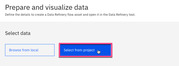
Select New asset.
Select Prepare and visualize data to create a new Data Refinery asset.

Under Select data, choose Select from project.
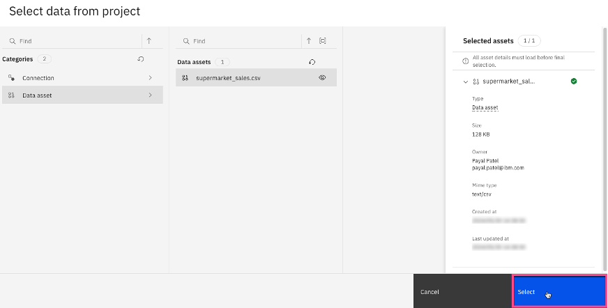
Select Data asset, then select supermarket_sales.csv to select the data set that you uploaded in Step 1. click Select.
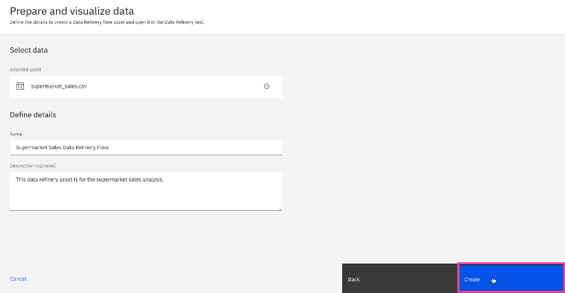
Define the data refinery flow, including Name and Description, and select create.
Allow a few minutes for the data set to load. After it's loaded, you see that a step was auto-generated. This step, convert column type, converts the column types in the data set. Additionally, you see the size of the data set in the view.
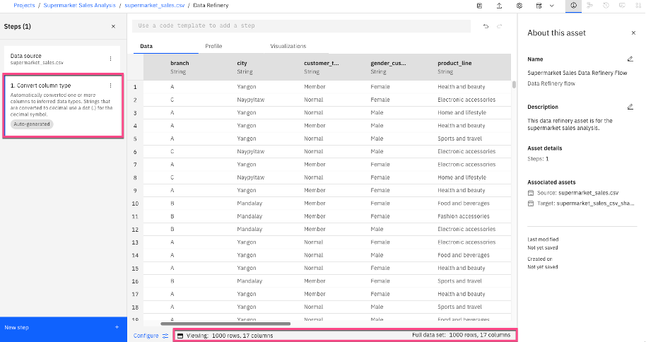
Note: Depending on size of the data set, you might either see all records or a sample of the data. With a sample of the data, the Data Refinery tool can be helpful to get an understanding of the data types, data values, and other patterns and insights in the data, allowing you to make decisions for data cleaning, data manipulation, and modeling. If you can see the entire data set, then you can also use the tool to create and share visualizations that are representative of the entire data set. If you have a larger data set than the Data Refinery tool will display and you need to create charts using the entire data set, consider using the chart builders tool in IBM SPSS to generate visualizations on the watsonx.ai platform.
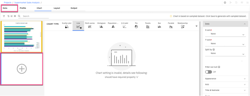
Step 3. create and format a data visualization
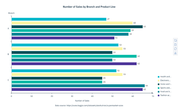
Now, create a bar chart to show the number of sales by branch and product line. Format it so that someone who is not familiar with the data can quickly interpret the chart and gain relevant insights.
Select the drop-down menu on the Visualizations tab, then select Bar for a bar chart.
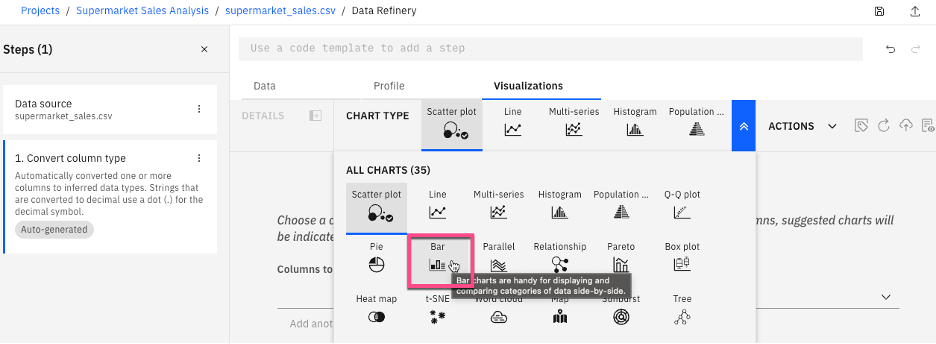
Note: Alternatively, you can create visualizations by selecting a column to visualize, and then viewing the recommended chart types.
On the left-hand pane, update the following parameters:
- category: branch
- Order based on: category value
- category order: Descending
- Summary: count
- Split by: product_line
- Split type: clustered
- Bar type: Y-axis
- Label position: right
Legend orient: Vertical bottom
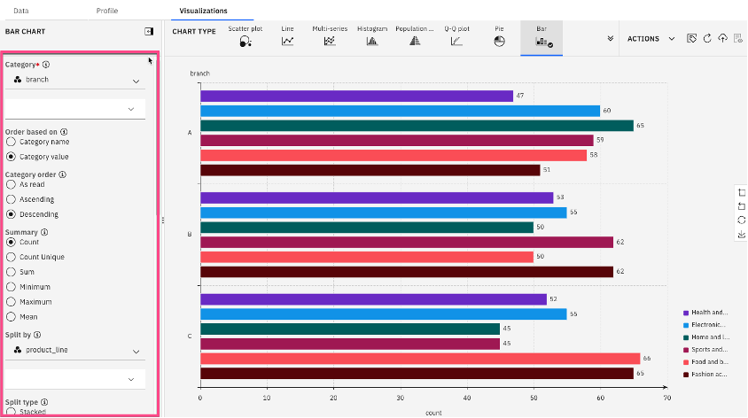
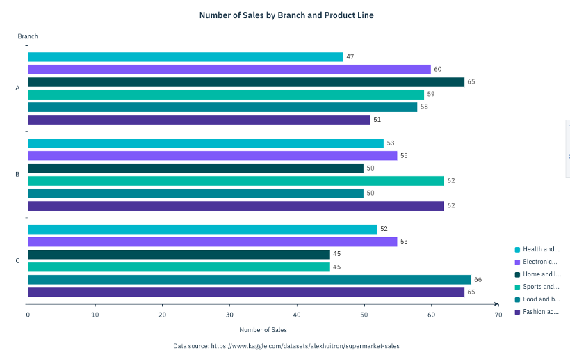
This gives the base of the bar chart, visualizing the number of sales by branch and product line.
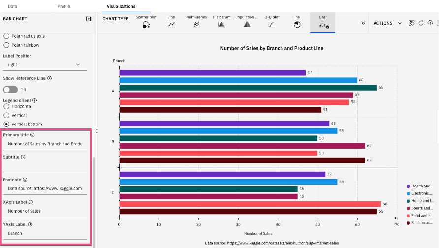
Format the bar chart by adding titles, footnotes, and labels as specified below.
- Primary title: Number of Sales by Branch and Product Line
- Footnote: Data source: https://www.kaggle.com/datasets/alexhuitron/supermarket-sales
- XAxis Label: Number of Sales
YAxis Label: Branch
Format fields in the visualization by selecting Actions, then Field format.
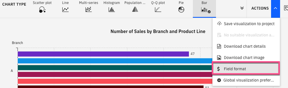
Set the format of the quantity field to Number. Additionally, set the unit_cost, revenue, and gross_income fields to currency and US Dollar (USD). Select Apply.

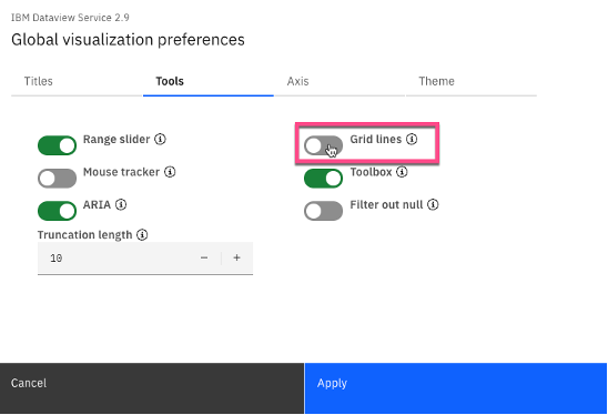
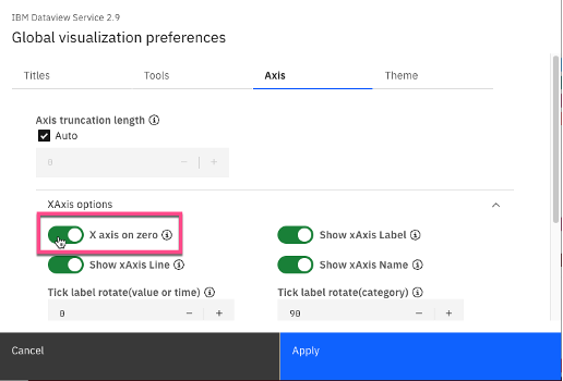
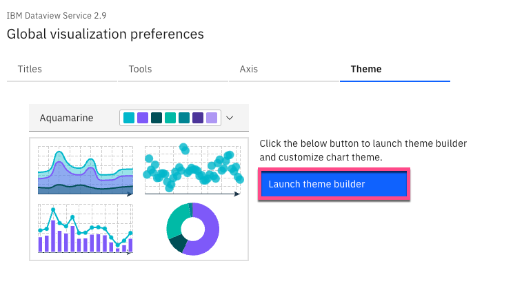
For additional chart formatting options, select Actions, then Global visualization preferences.
a. Under Titles, ensure Title alignment is set to center.

b. Under Tools, uncheck Grid lines.
c. Under Axis, ensure that the Xaxis and Yaxis options are set to on zero.
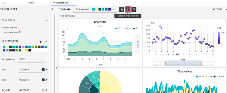
d. Under Theme, select the drop-down options next to carbon light, and select Aquamarine as the new theme.
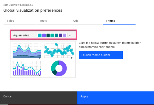
e. Select Apply to apply the changes to the current visualization. The following image shows the changes to the data visualization after the new theme is applied.
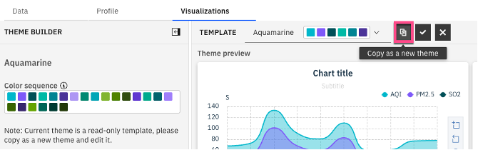
(Optional) To create a custom theme, select Actions, Global visualization preferences, and Theme. Then, Launch theme builder.
a. Select the copy as a new theme icon that's next to the current theme.
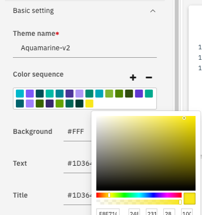
b. The left-hand pane contains options to update the theme name, color sequence, background, and text colors, among other things. Update the following fields.
- Theme name: Aquamarine-v2
- color sequence:
- Use the + and – buttons to add and remove colors from the theme
- Replace a color in the theme by selecting one of the colors within the color sequence, and selecting a new color.
Background: #FFF
c. Select Apply theme to chart.
Step 4. Export the data visualization
Now that the data visualization has been created, it’s time to export it so that it can be shared with others, and so that it can be viewed at a later time.
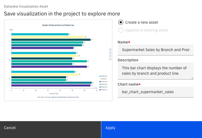
Select Actions, then Save visualization to project to save the visualization to the project in the IBM watsonx.ai platform.

Define the asset details, including Name, Description, and chart name, and then select Apply. Select close.
To save the chart to your local machine, select Actions, then select Download chart image.

The following image shows the chart after it's downloaded.
Save the Data Refinery flow, and go back to Assets in project to view the saved chart. Select the chart name to view the visualization.
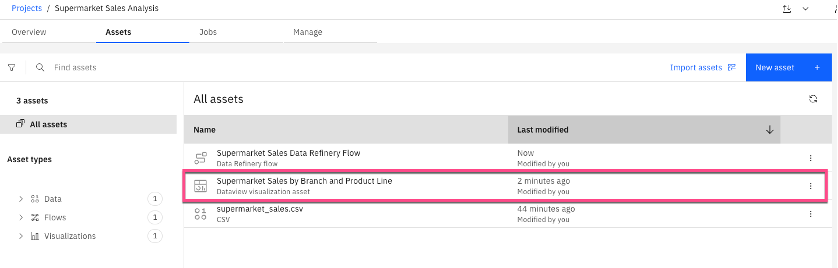
In the saved chart asset, you can filter, edit, and add new visualizations. To do this, you must reconnect the data source on the Data tab. Then, you can edit and add new visualizations.
Summary
In this tutorial, you learned how to create a Data Refinery flow, create and format data visualizations, and export and share visualizations on IBM watsonx.ai. You’re now ready to use the Data Refinery tool in your next machine learning or AI project on IBM watsonx.ai.
Try watsonx for free
Build an AI strategy for your business on one collaborative AI and data platform called IBM watsonx, which brings together new generative AI capabilities, powered by foundation models, and traditional machine learning into a powerful platform spanning the AI lifecycle. With watsonx.ai, you can train, validate, tune, and deploy models with ease and build AI applications in a fraction of the time with a fraction of the data.
Next steps
Explore more articles and tutorials about watsonx on IBM Developer.
If you want to learn more, take a look at the following resources:
Data Visualization
Machine learning (both unsupervised and supervised learning)