About cookies on this site Our websites require some cookies to function properly (required). In addition, other cookies may be used with your consent to analyze site usage, improve the user experience and for advertising. For more information, please review your options. By visiting our website, you agree to our processing of information as described in IBM’sprivacy statement. To provide a smooth navigation, your cookie preferences will be shared across the IBM web domains listed here.
Article
From data to prediction: Building a robust predictive analytics pipeline
Use machine learning to predict employee stress and enable preemptive remediation
On this page
Predictive analytics has quickly become a cornerstone of modern applications- powering everything from customer churn forecasting to equipment failure detection. But building accurate, reliable predictions requires more than just choosing a machine learning model, it demands a well-structured analytics pipeline.
In this article, we walk through the end-to-end process of going from raw data to actionable predictions. Using a sample dataset on employee workload and stress levels only for illustration, we’ll explain the predictive analytics pipeline architecture, walk step-by-step through our POC implementation, and include code snippets so you can apply the same approach to your own use cases. Developers and data engineers can use this practical guide to design, implement, and scale predictive analytics systems.
The research at a glance
This article is based on an IEEE conference paper, where we first presented this research.
This article proposes a machine learning model, based on the XGBoost (Extreme Gradient Boosting) classifier, for identifying employees who are likely under stress by analyzing the employees stress level data.
Key findings include:
top stress level indicators:
- Working hours: Long hours correlate strongly with increased stress.
- Role ambiguity: Unclear responsibilities lead to anxiety and reduced performance.
- Workload: An excessive workload diminishes employee satisfaction and engagement.
- Age: Employees in the 35–38 age group are particularly vulnerable to stress.
Departmental analysis: Sales teams experienced the highest stress levels compared to other departments like Research & Development and HR.
These factors were found to correlate strongly with reported stress, especially among employees in the Sales department.
Data characteristics
- Imbalanced data: 4.67:1 ratio between non-stressed and stressed employees.
- Data cleansing: Cleaned using statistical techniques like mean/mode imputation and standardization.
- Sampling: Balanced using sampling techniques and boosting algorithms.
Model performance: XGBoost classifier
- Training accuracy: 83.76%
- Testing accuracy: 81.68%
- Confusion matrix: Showed strong performance on majority class, but needs improvement on recall for stressed employees.
We used XGBoost for its ability to handle missing values, its built-in regularization to prevent overfitting, and its super performance over traditional classifiers like SVMs and decision trees.
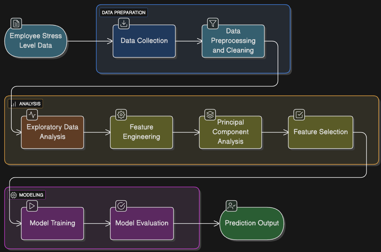
Overall architecture flow
A robust predictive analytics pipeline typically involves several interconnected components:
- Data ingestion and collection. Data is collected from diverse sources such as HR systems, employee surveys, work logs, and operational metrics to capture various signals that might indicate stress levels.
- Data preprocessing and cleaning. Raw data often contains missing values, inconsistencies, or noise. Techniques like mean/mode imputation, standardization, and balancing via sampling ensure the dataset is clean and ready for modelling.
- Feature engineering. Selecting relevant features and transforming them meaningfully improves model accuracy. For example, categorical features like department or role are encoded, while numeric features like workload are standardized.
- Model training and evaluation. Machine learning algorithms are trained on processed data to predict stress levels. Popular choices include boosting algorithms and ensemble methods, which balance bias and variance effectively.
- Prediction and remediation. The trained model predicts employee stress in real-time or batch mode. These predictions trigger preemptive interventions, such as targeted messaging, resource allocation, or manager alerts to mitigate stress.
How it works: From data to prediction
Let’s build a simple predictive analytics pipeline in Python, modelling a classification problem where the goal is to predict the stress level of employees.
The robust analytics pipeline that we used for this research is described in the following steps.
Step 1: Data ingestion
We load the dataset from employee records, which includes fields such as age, job role, workload level, job satisfaction, monthly income, and so on. We pull the data from its source. Inn production environments, this might be a database, streaming queue, or object storage.
import matplotlib.pyplot as plt
import pandas as pd
import seaborn as sns
# ^^^ pyforest auto-imports - don't write above this line
#Reading dataset
Data =pd.read_csv("employee_stress_data.csv",sep=';')
Step 2: Data preprocessing
We clean and standardize the data. We use a combination of mean for numeric columns and mode for categorical ones. Here, we fix missing values and inconsistencies to ensure the model isn’t learning from flawed inputs.
# Fill numeric missing values with mean
data.fillna(data.mean(numeric_only=True), inplace=True)
# Fill categorical missing values with mode
for column in data.columns:
    data[column].fillna(data[column].mode()[0], inplace=True)
# Check remaining nulls
data.isnull().sum()
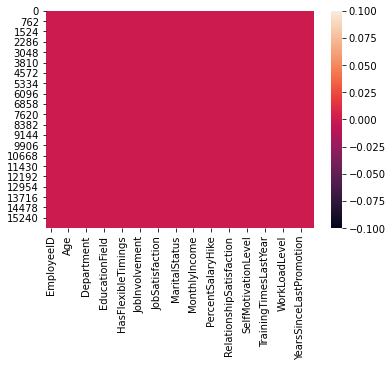
Step 3: Visualize missing data
This visualization is useful to quickly spot patterns of missing data across rows and columns.
sns.heatmap(data.isnull(), cbar=False)
plt.title("Null Value Heatmap")
plt.show()
For example, if an entire column is shaded, it means that column has many missing values, which might need imputation or removal.
Step 4: Feature engineering
The goal of this feature engineering step is to prepare the raw data for machine learning by transforming both numerical and categorical variables into a form suitable for model training. We encode categorical variables into one-hot vectors and scale numeric variables to normalize values.
from sklearn.preprocessing import StandardScaler
import numpy as np
# Separate numeric and categorical features
numerical = data[['WorkLoadLevel', 'AvgDailyHours']]
categorical = pd.get_dummies(data[['Department', 'JobRole']])
# Scale numerical features
scaler = StandardScaler()
numerical_scaled = scaler.fit_transform(numerical)
# Combine all features
X = np.hstack([numerical_scaled, categorical])
y = data['Stress_Level']
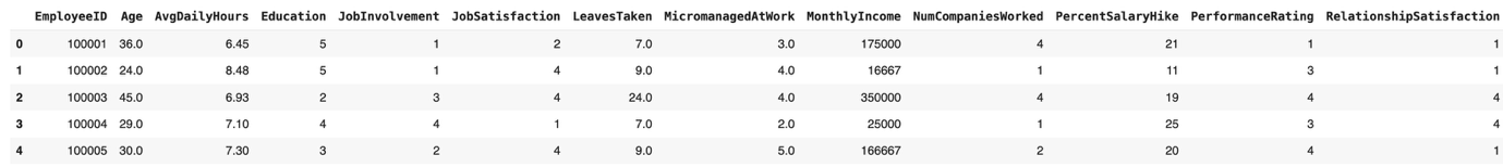
The following screen capture shows the sample numeric data.
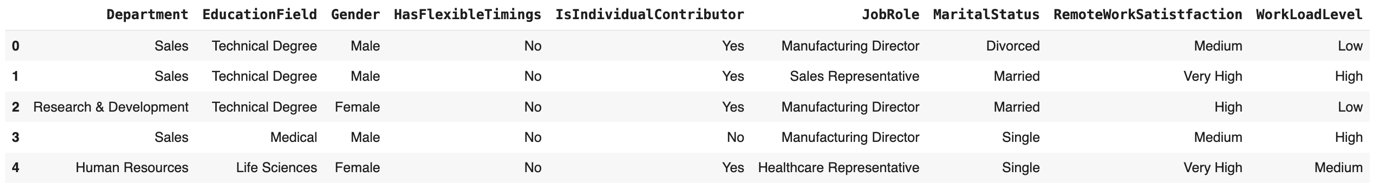
The following screen shot shows the categorical data.
Step 5: Exploratory data analysis (EDA)
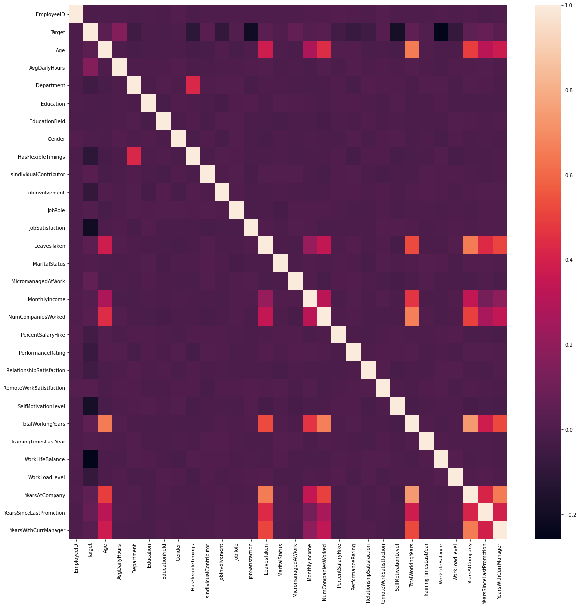
We used heatmaps, correlation, and histograms to understand our data.
The correlation heatmap (as shown in the following image) visualizes the pairwise relationships between numerical features. By examining these patterns, we can detect multicollinearity (where features are highly correlated with each other), which is important for dimensionality reduction and avoiding redundancy in machine learning models.
Step 6: Model training & evaluation
We used XGBoost, along with dimensionality reduction via PCA (Principal Component Analysis), to optimize the model by reducing redundant features.
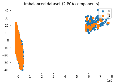
To better visualize high-dimensional data, we applied PCA. PCA reduces the dataset into a smaller number of components while retaining most of the variance (information). In this case, we reduced the features to 2 principal components, allowing us to plot the dataset in a 2D space. This helps us:
- Understand the overall distribution of data.
- Check how different classes are separated (or overlapping).
- Gain insights into the imbalances or clusters in the dataset.
We used a 2D scatter plot to provide an intuitive visual representation of how the imbalanced dataset is spread across the reduced feature space.
from sklearn.decomposition import PCA
pca = PCA(n_components=2)
X = pca.fit_transform(X)
plot_2d_space(X, y, 'Imbalanced dataset (2 PCA components)')
To build a robust predictive model, we used XGBoost, a high performance, scalable machine learning algorithm widely used for classification tasks. XGBoost is particularly effective because it:
- Handles imbalanced datasets well.
- Provides regularization to reduce overfitting.
- Efficiently manages both numeric and categorical features.
from xgboost import XGBClassifier

from sklearn.model_selection import train_test_split
from sklearn.metrics import accuracy_score
from sklearn.metrics import confusion_matrix, recall_score, precision_score, f1_score, roc_auc_score,accuracy_score
# Prepare final dataset
X = pd.concat([X_num, y_cat], axis=1)
y = data['Target']  # Target: 0 = not stressed, 1 = stressed
# Train/test split
X_train, X_test, y_train, y_test = train_test_split(X, y, test_size=0.2)
# Model
model = XGBClassifier()
model.fit(X_train, y_train)
y_pred = model.predict(X_test)

print('Recall: \n',recall_score(y_test,y_pred))
print("Precision:",precision_score(y_test,y_pred))
print("F1 Score:",f1_score(y_test,y_pred))
print("Roc Auc Score:",roc_auc_score(y_test,y_pred))
accuracy = accuracy_score(y_test, y_pred)
print("Accuracy: %.2f%%" % (accuracy * 100.0))
The following graph illustrates a visualization of an imbalanced dataset using two PCA components. Each point on the scatter plot represents an observation from the dataset, reduced to two principal components by PCA, a technique commonly used for dimensionality reduction and visualization of high-dimensional data.
Step 7: Prediction & deployment
In production, we wrapped the final trained model (XGBoost in this case) and the prediction logic into a REST API endpoint. This included:
- Data preprocessing (scaling, encoding) pipeline
- The trained model
A prediction function, for example:
# Example: Predict for a new record
  new_employee = [[55, 10, 0,1,0, 1,0,0]]  # Scaled + One-hot vector form
  prediction = model.predict(new_employee)

  print("Predicted Stress Level:", prediction)
Pipeline best practices for developers
To develop your own predictive analytics pipeline, consider these best practices adapted from our research and POC:
- Automate the pipeline with tools like Airflow or Kubeflow to orchestrate ETL and training jobs.
- Monitor your pipeline for data quality issues and model performance drift.
- Use version control for both code and datasets for reproducibility.
- Implement data access policies (governance) to handle sensitive fields responsibly.
- Iterate and adjust features and retrain your data as business context changes.
Conclusion
Predictive analytics pipelines like the one described in this article empower teams to move from reactive to proactive operations. Developers play a key role in architecting these systems to be efficient, transparent, and adaptable.
By understanding the end-to-end flow of data, from raw data ingestion, through preprocessing and feature engineering, PCA, to model deployment and prediction, developers can build solutions that provide valuable foresight, such as predicting employee stress before it impacts productivity.
Building a predictive analytics pipeline requires more than good algorithms. You need clean data, meaningful features, robust model training, and scalable deployment. By following an architecture-first approach and applying the steps described in this article, you can design pipelines that produce actionable predictions in real-world settings. To get hands-on, consider converting this pipeline into a Jupyter Notebook and extending it with:
- Hyperparameter tuning. To learn more about XGBoost and how to perform hyperparamter tuning, check out this tutorial, “Implement XGBoost in Python.”
- Cross-validation
- Model explainability (for example SHAP or LIME)
- Deployment to cloud services