About cookies on this site Our websites require some cookies to function properly (required). In addition, other cookies may be used with your consent to analyze site usage, improve the user experience and for advertising. For more information, please review your options. By visiting our website, you agree to our processing of information as described in IBM’sprivacy statement. To provide a smooth navigation, your cookie preferences will be shared across the IBM web domains listed here.
Tutorial
Cluster analysis in R
Generate synthetic data and compare how different clustering algorithms perform on that data
On this page
Clustering is a unsupervised learning technique for partitioning and segmenting data, and it is an important part of conducting an exploratory analysis. Clustering is a commonly used approach to many tasks in data science. Clustering can help in identifying underlying data generation processes, key dimensions for dimensionality reduction, or outliers.
In R, there are libraries that help perform some of the most commonly used clustering algorithms like KNN, Medoids, Hierarchical Clustering, and Gaussian Mixed Models through Expectation-Maximization.
In this tutorial, we’ll use a number of R packages to generate synthetic data and then compare how different clustering algorithms perform on that data. We’ll also use visualization techniques to predict the optimal numbers of clusters for different techniques and to generate visualizations of how different clustering techniques perform.
Prerequisites
You need an IBM Cloud account to create a watsonx.ai project.
Steps
Step 1. Set up your environment
While you can choose from several tools, this tutorial walks you through how to set up an IBM account to use a Jupyter Notebook. Jupyter Notebooks are widely used within data science to combine code, text, images, and data visualizations to formulate a well-formed analysis.
Log in to watsonx.ai using your IBM Cloud account.
Create a watsonx.ai project.
Create a Jupyter Notebook using the R Kernel.
This step will open a Notebook environment where you can generate your dataset and copy the code from this tutorial to implement different clustering algorithms.
Step 2. Install and import relevant libraries
In this step, we'll import the necessary R libraries.
install.packages("mvtnorm", "dplyr", "ggplot2", "fpc", "caret", "mclust", "factoextra", "cluster")

    for(pkg in c("mvtnorm", "dplyr", "ggplot2", "fpc", "caret", "mclust", "factoextra", "cluster")){
      suppressPackageStartupMessages(library(pkg, character.only = TRUE))
    }

    set.seed(42)
Step 3. Create the data
For this tutorial we’ll generate data so that we can be sure of the underlying structure and have labels for our dataset to compare the efficacy of different methods. We generate 3 clusters using normal distributions. Each data point has three features: an x value, a y value, and a class that labels the point. We'll have three classes that we'd like our clustering algorithms to represent as clusters.
dataset <- {
      #create our 3 distributions
      cluster1 = data.frame(rmvnorm(40, c(0, 0), diag(2) * c(2, 1))) %>% mutate(class=factor(1))
      cluster2 = data.frame(rmvnorm(100, c(3, 3), diag(2) * c(1, 3))) %>% mutate(class=factor(2))
      cluster3 = data.frame(rmvnorm(60, c(6, 6), diag(2))) %>% mutate(class=factor(3))

      #bind them together
      data = bind_rows(cluster1, cluster2, cluster3)
      #set the column names
      names(data) = c("x", "y", "class")
      #return the data
      data
    }
Since the data is being generated here we don’t need to check for missing values or normalize our features. If our x feature had values between -1000 and 1000 and our y feature had values between -1 and 1, we would want to normalize those so that distance measures could be calculated accurately. In this case though, that’s not necessary.
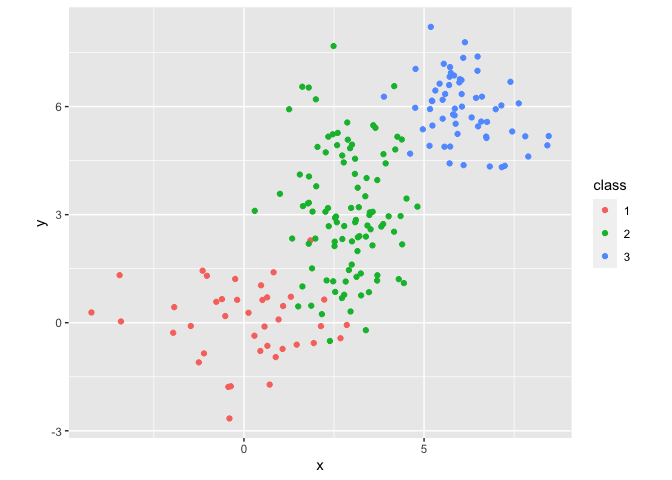
We can plot our data in a scatter plot using ggplot to see the natural clustering that we’ll try to replicate:
dataset %>% ggplot(aes(x=x, y=y, color=class)) +
      geom_point() +
      coord_fixed() +
      scale_shape_manual(values=c(0, 1, 2))
We can see in this visualization that the boundaries between clusters are not well defined, which will present an interesting challenge and basis for comparison with our clustering algorithms.
Step 4. Use K-means and medoids to cluster data
K-means clustering is one of the most commonly used unsupervised machine learning algorithms for partitioning a given data set into a set of k clusters, where k represents the number of groups pre-specified by the analyst. It classifies objects in multiple groups so that objects clustered together are as similar as possible, referred to as high intra-class similarity, and objects from different clusters are as dissimilar as possible, referred to as low inter-class similarity. In k-means, each cluster is represented by its centroid, which corresponds to the mean of points assigned to the cluster.
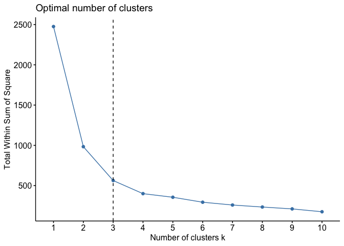
To check the optimal number of clusters, we can use the fviz_nbclust method.
fviz_nbclust(dataset, kmeans, method = "wss") + geom_vline(xintercept = 3, linetype = 2)
We want to look at the elbow of the plot where the within-cluster sum of squares drops significantly.
Now that we know the optimal number of clusters we can perform a k-means clustering. By default the call to kmeans() will minimize the Euclidean distance between data points to define clusters.
k = 3
    kmeans_clustering <- kmeans(dataset[c("x", "y")], centers = k, nstart = 20)
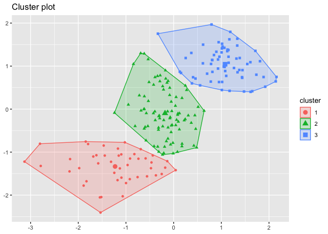
We can use the fviz_cluster() method to view the results of our K-means clustering.
fviz_cluster(kmeans_clustering, dataset[c("x", "y")], xlab = FALSE, ylab = FALSE, geom="point")
We can check the accuracy of our clustering in a plot:
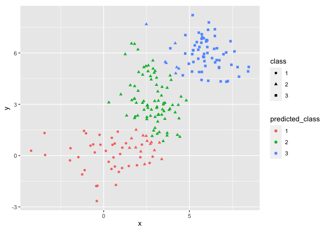
kmeans_res <- dataset
    kmeans_res['predicted_class'] = factor(kmeans_clustering$cluster)

    kmeans_res %>% ggplot(aes(x=x, y=y, shape=class, color=predicted_class)) +
      geom_point() +
      coord_fixed() +
      scale_shape_manual(values=c(0, 1, 2)) +
      scale_shape(solid = TRUE)
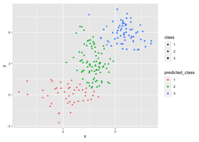
We see that K-means clustering results match our data quite well but this approach has some trouble with our clusters overlapping. This is to be expected since we generated a tricky dataset to use and the cluster means don’t fully capture the structure of the data. Since we know the labels, we can check the accuracy using a confusion matrix.
knn_conf_mat <- confusionMatrix(factor(kmeans_clustering$cluster), factor(dataset$class), mode = "everything", positive="1")
This gives us a confusion matrix and an accuracy score.
print(knn_conf_mat)
Which returns:
Confusion Matrix and Statistics

               Reference
     Prediction  1  2  3
              1 39  7  0
              2  1 86  0
              3  0  7 60

     Overall Statistics

                    Accuracy : 0.925
                      95% CI : (0.8793, 0.9574)
         No Information Rate : 0.5
         P-Value [Acc > NIR] : < 2.2e-16

                       Kappa : 0.8821
Accuracy is perhaps the most basic evaluation metric for classification models, although it does not always offer a complete picture of model performance.
Kappa is also known as Cohen’s kappa. This is another accuracy metric that indicates the level of agreement between the ground truth and predictions beyond the level of agreement resulting from chance.
For comparison now we can use medoids instead of using centroids with the pam() clustering. Unlike the k-means algorithm, using medoids selects a median point to calculate the clusters rather than cluster centroids.
pam_k = 3
    pam_clustering <- pam(dataset[c("x", "y")], pam_k)
By visual inspection, we can see that this performs slightly worse:
pam_res <- dataset
    pam_res['predicted_class'] <- factor(pam_clustering$cluster)

    pam_res %>% ggplot(aes(x=x, y=y, shape=class, color=predicted_class)) +
      geom_point() +
      coord_fixed() +
      scale_shape_manual(values=c(0, 1, 2)) +
      scale_shape(solid = TRUE)

     Scale for shape is already present.
     Adding another scale for shape, which will replace the existing scale.
Checking the accuracy with a confusion matrix gives us the following results:
pam_conf_mat <- confusionMatrix(factor(pam_clustering$cluster), factor(dataset$class), mode = "everything", positive="1")
    print(pam_conf_mat)
This shows that the medoids approach doesn't work quite as well as the centroids:
Confusion Matrix and Statistics

               Reference
     Prediction  1  2  3
              1 39 14  0
              2  1 79  0
              3  0  7 60

     Overall Statistics

                    Accuracy : 0.89
                      95% CI : (0.8382, 0.9298)
         No Information Rate : 0.5
         P-Value [Acc > NIR] : < 2.2e-16

                       Kappa : 0.8299
To learn more about how to perform K-means clustering in R, see this tutorial, "K-means clustering using R on IBM watsonx.ai." To learn more about using a confusion matrix in R, see this tutorial, "Create a confusion matrix with R."
Step 5. Use Hierarchical clustering
We'll look at two types of hierarchical clustering:
- Agglomerative clustering
- Divisive clustering
Agglomerative clustering
Agglomerative clustering is the most common type of hierarchical clustering used to group objects in clusters based on some similarity metric. This begins by treating each individual data point as a cluster and successively merging upwards until all clusters have been merged into one cluster at the base of the tree. The result is a tree-based representation of the objects called a dendrogram. Hierarchical clustering relies on maximizing the dissimilarity of each cluster but this can also make it more sensitive to outliers when performing segmentation.
One of the most commonly used is the hclust() method of the stats library. First we construct distance matrix of the distances for between each point using a Euclidean distance and then construct the hierarchical clustering using a call to hclust. Each datasets may perform differently with different distance measures but in this case a simple Euclidean distance will work as well as any other distance metric since the data has the same range along all features.
distances = dist(dataset[c("x", "y")], method = 'euclidean')
    agglomerative_clustering <- hclust(distances, method = 'average')
Now we can visualize the resulting dendogram:
fviz_dend(agglomerative_clustering, cex = 0.5, k = 3, color_labels_by_k = TRUE, show_labels=FALSE)
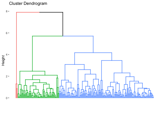
In this case though, the agglomerative clustering doesn’t represent our data especially well as we can see in the dendrogram. We can compare the actual labels to the generated clusters:
cut_avg <- cutree(agglomerative_clustering, k = 3)
    dataset_agg_cluster <- mutate(dataset, cluster = cut_avg)
    ggplot(dataset_agg_cluster, aes(x=x, y = y, color = factor(cluster), shape=class)) + geom_point()
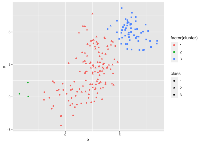
Again, we’ll check the accuracy and Kappa coefficient with a confusion matrix:
ac_conf_mat <- confusionMatrix(factor(dataset_agg_cluster$cluster), factor(dataset_agg_cluster$class), mode = "everything", positive="1")
    print(ac_conf_mat)
We can see that this has poor accuracy:
Confusion Matrix and Statistics

               Reference
     Prediction  1  2  3
              1 37 99  1
              2  3  0  0
              3  0  1 59

     Overall Statistics

                    Accuracy : 0.48
                      95% CI : (0.409, 0.5516)
         No Information Rate : 0.5
         P-Value [Acc > NIR] : 0.7377

                       Kappa : 0.3207
Divisive clustering
Now we’ll look at a divisive clustering approach to our dataset. The inverse of agglomerative clustering is divisive clustering, which can be with the diana() function (DIvisive ANAlysis). This algorithm works in a top-down manner, beginning at the root representing all the data points in a single cluster. At each step of iteration, the most heterogeneous cluster is divided into two. The process is iterated until all objects are in their own cluster.
# compute divisive hierarchical clustering
    divisive_clustering <- diana(dataset[c("x", "y")])
    # Divise coefficient
    print(divisive_clustering$dc)

     [1] 0.973885
Now we can check the generated dendogram:
#plot using a colors dendrogram to see our clusters with 3 groups
fviz_dend(divisive_clustering, cex = 0.5, k = 3, color_labels_by_k = TRUE, show_labels=FALSE)
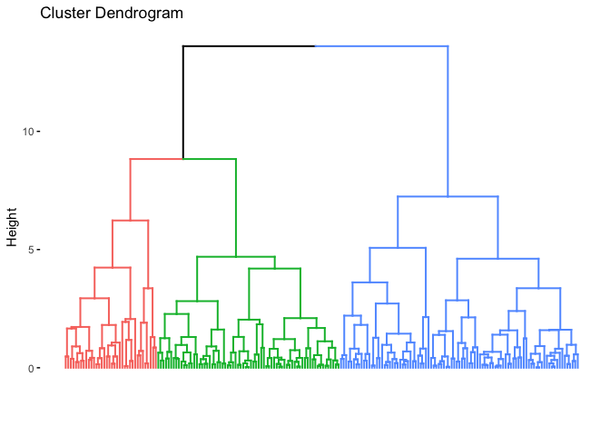
When we check the confusion matrix, we can see that this structure represents our data much more accurately than the agglomerative clustering:
dc_conf_mat <- confusionMatrix(factor(cutree(divisive_clustering, k = 3)), factor(dataset$class), mode = "everything", positive="1")
    print(dc_conf_mat)
The divisive approach performs much better than the agglomerative approach:
Confusion Matrix and Statistics

           Reference
 Prediction  1  2  3
          1 35  1  0
          2  5 66  0
          3  0 33 60

 Overall Statistics

                Accuracy : 0.805
                  95% CI : (0.7432, 0.8575)
     No Information Rate : 0.5
     P-Value [Acc > NIR] : < 2.2e-16

                   Kappa : 0.6986
Next, we can look at an approach that should better match our underlying data process.
Step 6. Use Gaussian Mixed Models to cluster
Model-based clustering, which treats the data as though it is coming from a distribution which is a mixture of two or more clusters. Unlike k-means, the model-based clustering uses a soft assignment, where each data point has a probability of belonging to each cluster. Each cluster is modeled by the normal or Gaussian distribution which is described by the following parameters:
µk: mean vector
Σk: covariance matrix
An associated probability in the mixture. Each point has a probability of belonging to each cluster.
We can create a GMM clustering with the Mclust function in the Mclust package. Our data is roughly normalized but if the dimensions of our features are very different, we’ll want to make sure that we normalize those features in our data preparation.
library(mclust)   # for fitting clustering algorithms

    # Create a GMM model
    dataset_mc <- Mclust(dataset[c('x', 'y')])
    summary(dataset_mc)

     ----------------------------------------------------
     Gaussian finite mixture model fitted by EM algorithm
     ----------------------------------------------------

     Mclust EVI (diagonal, equal volume, varying shape) model with 3 components:

      log-likelihood   n df       BIC       ICL
           -805.8015 200 12 -1675.183 -1701.315

     Clustering table:
      1  2  3
     97 39 64
After fitting the model we should look at a summary of the model using the summary() method. We can see that the model inferred the the correct number of clusters:
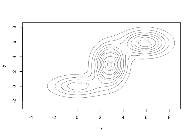
# Plot results
    plot(dataset_mc, what = "density")
We can look at a confusion matrix to check how well our model fits the data. One aspect of this to note is that the cluster assignment generated by mclust may not match our original labels. To get a correct measure of accuracy, we’ll recode the generated labels so that the cluster membership matches our original labels.
mc_recoded <- recode(dataset_mc$classification, '1' = '2', '2' = '1', '3' = '3')
    gmm_conf_mat <- confusionMatrix(factor(mc_recoded), factor(dataset$class), mode = "everything", positive="1")
    print(gmm_conf_mat)
The GMM approach show fairly high accuracy and Kappa values:
Confusion Matrix and Statistics

               Reference
     Prediction  1  2  3
              1 36  3  0
              2  4 93  0
              3  0  4 60

     Overall Statistics

                    Accuracy : 0.945
                      95% CI : (0.9037, 0.9722)
         No Information Rate : 0.5
         P-Value [Acc > NIR] : < 2.2e-16

                       Kappa : 0.9116
Since our original data was constructed from three Gaussian mixtures, we shouldn’t be surprised to see that this model based approach reconstructs it quite well.
Our model does seem to have some trouble where the edges of the distributions representing our different clusters overlap with one another. One helpful feature of the GMM approach to clustering is that we can see the uncertainty of the model by plotting the uncertainty of the model:
plot(dataset_mc, what = "uncertainty")
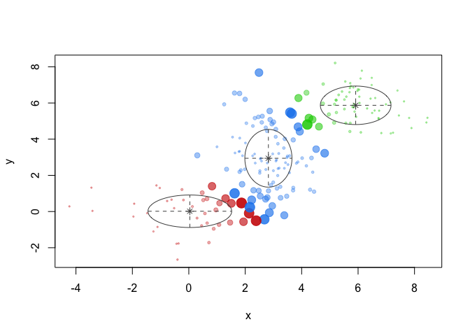
This shows us which members of our discovered clusters the model is least certain about. In the graph, larger data points have more uncertainty, smaller have less. The GMM approach performs well with outlier points but we can see that the overlapping areas of the distributions are difficult for our model to identify correctly, but this approach has the advantage of returning the uncertainty for each data point.
Step 7. Compare the accuracy of each method
Now we can look at the results of each of our clustering methods:
comparison <- c(c(knn_conf_mat$overall[[1]], pam_conf_mat$overall[[1]], ac_conf_mat$overall[[1]], dc_conf_mat$overall[[1]], gmm_conf_mat$overall[[1]]),
                    c(knn_conf_mat$overall[[2]], pam_conf_mat$overall[[2]], ac_conf_mat$overall[[2]], dc_conf_mat$overall[[2]], gmm_conf_mat$overall[[2]]))

    comparison <- matrix(comparison, nrow=2, byrow=TRUE)

    colnames(comparison) = c('KNN','Medoids','Agglomerative','Divisive', 'GMM')
    rownames(comparison) <- c('Accuracy','Kappa')
Now we can generate the table:
as.table(comparison)
Which returns a table for easy comparison:
KNN   Medoids Agglomerative  Divisive       GMM
     Accuracy 0.9250000 0.8900000     0.4800000 0.8050000 0.9450000
     Kappa    0.8820755 0.8298531     0.3207054 0.6986090 0.9116466
We can see that the GMM approach performs slightly better than the KNN and that, with the data that we’ve generated, hierarchical approaches don’t model the underlying data as well. That is much more a reflection of our data rather than a feature of hierarchical clustering. Finding the right approach to modeling your data will depend on your dataset and what you’re looking to uncover by clustering.
Summary and next steps
In this tutorial, we looked at generating a complex data set with natural clusters and the basics of how different clustering algorithms perform on that data. The data consisted of 3 natural clusters defined by normal distributions. We then looked at how to perform clustering using KNN, Medoids, Hierarchical Clustering, and Gaussian Mixed Models. Finally, we compared the accuracy of these algorithms using a confusion matrix to generate Accuracy and Kappa scores.
Try watsonx for free
Build an AI strategy for your business on one collaborative AI and data platform called IBM watsonx, which brings together new generative AI capabilities, powered by foundation models, and traditional machine learning into a powerful platform spanning the AI lifecycle. With watsonx.ai, you can train, validate, tune, and deploy models with ease and build AI applications in a fraction of the time with a fraction of the data.
Try watsonx.ai, the next-generation studio for AI builders.
Next steps
Explore more articles and tutorials about watsonx on IBM Developer.
Also, to learn more about clustering algorithms, read this article, "Unsupervised learning for data classification."